
CSS (cascading style sheets)
CSS is used to style the HTML document and it consists of 3 major attributes
- Selectors:[a selector is an HTML tag at which you can apply a style such as <h1> or <p1> etc]
- Property: [for example, colour is a property which denotes the colour of the text ]
- Property value:[ for example, the colour property has property value #ff0000 for red and #00ff00 for green]
Syntax
Selector{ property: property value;}Style tag
To write a CSS you need to use style tag <style></style> but is recommended to place in the <head></head> tags of your html document
How to link a CSS style sheet to an HTML document
There are three ways by which you can link a CSS style sheet to an HTML document
- External
- Internal
- Inline
font-size property
<!DOCTYPE html>
<html>
<head>
<style type="text/css">
div
{
   font-size: 1rem;
   color:#00FF00;
}
#div2{

    font-size: 150%;
    color:#DFFF00;
}
#div3{

    font-size: 28px;
    color:#AF7AC5;
}
</style>
</head>
<body>
<div>Hello there people! the text has a front-size of 2rem</div>
<div id="div2">Hello there people! the text has a front-size of 200%  </div>
<div id="div3">Hello there people! the text has a front-size of 50px </div>
</body>
</html>Margin, border, and padding
To write CSS we have a box-like model that contains margin, border, and padding that work in an ordered way first the padding will operate on an element such as a text or an image second, above the padding, the border will operate third, finally, the margin will operate on the border
The margin, border, and padding will have four properties such as top, bottom, left, right
Margin.
border
padding
The margin properties
p {
  border: 1px solid black;
  margin-top: 10px;
  margin-bottom: 100px;
  margin-right: 50px;
  margin-left: 50px;
  background-color: #FFFF00;
}
Margin shorthand property
p {
  margin: 10px 100px 50px 50px;
}
The border properties
p.border {border-top:1px solid  #800080;
border-right:  2px dashed #FF00FF;
border-bottom: 3px dotted #0000FF;
border-left:   5px solid  #00FF00;
border-radius: 60px;
}
border shorthand property
p.border-1 {
border-color: #800080 #FF00FF #0000FF #00FF00;
border-style: solid dashed dotted solid;
border-width: 1px 2px 3px 5px;
}
The padding properties
p {
  border: 1px solid black;
  background-color: #00FF00;
  padding-top: 20px;
  padding-right: 50px;
  padding-bottom: 80px;
  padding-left: 60px;
}
padding shorthand property
p {
  border: 1px solid black;
  background-color: #00FF00;
  padding-top: 20px;
  padding-right: 50px;
  padding-bottom: 80px;
  padding-left: 60px;
}
Border
Border-style properties
- solid
- dotted
- dashed
- double
- groove
- ridge
- inset
- outset
- hidden
<!DOCTYPE html>
<html >
<head>
<meta name="viewport" content="width=device-width, initial-scale=1">
    <style>
        .container-11{
            display:flex;
        }
             .container-11>div{

  color: #FF0000;
  padding: 0.5px;
  margin:10px;
             }


    </style>
</head>
<body>
<div style="overflow-x:auto;" class ="container-11">
<div  style=" border-style:solid;border-width: 20px;border-color:#FF0000;"><h1>solid</h1>
</div>
<div  style=" border-style:dotted;border-width: 20px;border-color:#FF0000;"><h1>dotted</h1>  </div>
<div  style=" border-style:dashed;border-width: 20px;border-color:#FF0000;"><h1>dashed</h1> </div>
<div  style=" border-style:double;border-width: 20px;border-color:#FF0000;"><h1>double</h1> </div>
<div  style=" border-style:groove;border-width: 20px;border-color:#FF0000;"><h1>groove</h1> </div>
<div  style=" border-style:ridge;border-width: 20px;border-color:#FF0000;"><h1>ridge</h1> </div>
<div  style=" border-style:inset;border-width: 20px;border-color:#FF0000;"><h1>inset</h1> </div>
<div  style=" border-style:outset;border-width: 20px;border-color:#FF0000;"><h1>outset</h1> </div>
</div>
</body>
</html>
solid
dotted
dashed
double
groove
ridge
inset
outset
Padding
<!DOCTYPE html>
<html >
<head>
    <style>

             .box-1{
                 border: 1px solid #4CAF50;


             }
             .box-2{
                 padding: 50px;
  border: 1px solid #4CAF50;
             }
             .box-3{
                 border: 1px solid #4CAF50;
                 padding-top: 50px;
  padding-right: 30px;
  padding-bottom: 50px;
  padding-left: 100px;

             }
    </style>
</head>
<body>
<div >
<div class = "box-1"><h1>Box 1</h1>
<p>Hello there people! The box-1 contains the div element that has no Padding  so, that you can see the difference between box with padding and a box without padding applied   </p>
</div>
<div class = "box-2"><h1>Box 2</h1> <p>Hello there people! The box-2 contains the div element that has<span style="color:#DE3163;"> total Padding of 50px,</span>  </p></div>
<div class = "box-3"><h1>Box 3</h1><p>Hello there people! The box-3 contains the div element that has a <span style="color:#DE3163;"> top Padding of 50px,</span> a <span style="color:#DE3163;">right Padding of 30px,</span> a <span style="color:#DE3163;">bottom Padding of 50px,</span> and a <span style="color:#DE3163;">left Padding of 100px.</span> </p></div>
</div>
</body>
</html>
Box 1
Hello there people! The box-1 contains the div element that has no Padding so, that you can see the difference between box with padding and a box without padding applied
Box 2
Hello there people! The box-2 contains the div element that has total Padding of 50px,
Box 3
Hello there people! The box-3 contains the div element that has a top Padding of 50px, a right Padding of 30px, a bottom Padding of 50px, and a left Padding of 100px.
Margins
Margins allow us, to create space around elements from the top, bottom, left, and right
<!DOCTYPE html>
<html  >
<head>
</head>
<body>
<h2 style="color:#DE3163;text-align:center;"> Margin properties-[right, left, bottom, top]</h2>
<div style="border:1px solid black;margin-top: 100px;margin-bottom: 10px;margin-right: 100px;margin-left: 80px;background-color: #FFBF00;">This div element has a top margin of 100px, a right margin of 150px, a bottom margin of 100px, and a left margin of 80px.</div>
<p style="border:1px solid black;margin-top: 20px;margin-bottom: 10px;margin-right: 10px;;margin-left:80px;background-color: #00FF00;"> the paragraph has a top margin of 20px, a bottom margin of 100px, a right margin of 10px, and a left margin of 80px</p>
</body>
</html>
Margin properties-[right, left, bottom, top]
the paragraph has a top margin of 20px, a bottom margin of 100px, a right margin of 10px, and a left margin of 80px
Flexbox
A flexbox is a CSS layout mode that provides a simple way to structure elements within a container and it is better to use flex instead of floats
Let us see an example to understand the concept of the flex-box model the below example shows that a container with div element has three box
<!DOCTYPE html>
<html >
<head>
    <style>
        .container-11{
        }
             .container-11>div{
              border:1px #ccc solid;
  color: black;
  padding: 10px;
             }
             .box-1{
             }
             .box-2{
             }
             .box-3{
             }
    </style>
</head>
<body>
<div class ="container-11">
<div class = "box-1"><h1>Box 1</h1>
<p>Hello there people! The box-1 contains the paragraph that holds some content to elaborate the concept of the flex box model </p>
</div>
<div class = "box-2"><h1>Box 2</h1> <p>Hello there people! The box-2 contains the paragraph that holds some content to elaborate the concept of the flex box model </p></div>
<div class = "box-3"><h1>Box 3</h1><p>Hello there people! The box-3 contains the paragraph that holds some content to elaborate the concept of the flex box model </p></div>
</div>
</body>
</html>
Box 1
Hello there people! The box-1 contains the paragraph that holds some content to elaborate the concept of the flex box model
Box 2
Hello there people! The box-2 contains the paragraph that holds some content to elaborate the concept of the flex box model
Box 3
Hello there people! The box-3 contains the paragraph that holds some content to elaborate the concept of the flex box model
<!DOCTYPE html>
<html >
<head>
    <style>
        .container-13{
            display:flex;
        }
             .container-13>div{
              border:1px #ccc solid;
  color: black;
  padding: 10px;
             }
             .box-4{
             }
             .box-5{
             }
             .box-6
             }
    </style>
</head>
<body>
<div class ="container-13">
<div class = "box-4"><h1>Box 1</h1>
<p>Hello there people! The box-1 contains the paragraph that holds some content to elaborate the concept of the flex box model </p>
</div>
<div class = "box-5"><h1>Box 2</h1> <p>Hello there people! The box-2 contains the paragraph that holds some content to elaborate the concept of the flex box model </p></div>
<div class = "box-6"><h1>Box 3</h1><p>Hello there people! The box-3 contains the paragraph that holds some content to elaborate the concept of the flex box model </p></div>
</div>
</body>
</html>
Box 1
Hello there people! The box-1 contains the paragraph that holds some content to elaborate the concept of the flex box model
Box 2
Hello there people! The box-2 contains the paragraph that holds some content to elaborate the concept of the flex box model
Box 3
Hello there people! The box-3 contains the paragraph that holds some content to elaborate the concept of the flex box model
<!DOCTYPE html>
<html >
<head>
    <style>
        .container-a>div{
             background: #0000FF;
  color: white;
   padding: 1px;
  border:1px #ccc solid;
  text-align:center;
  }
  .container-a{
      border:4px solid;
  }
        }
    </style>
</head>
<body>
<div class ="container-a">
<div >A</div>
<div>B</div>
<div>C</div>
<div>D</div>
<div>E</div>
<div>F</div>
<div>G</div>
<div>H</div>
<div>I</div>
</div>
</body>
</html><!DOCTYPE html>
<html >
<head>
<style>
.container-a>div{
background: #0000FF;
color: white;
padding: 1px;
border:1px #ccc solid;
text-align:center;
}
.container-a{
border:4px solid;
display:flex;
}
}
</style>
</head>
<body>
<div class ="container-a">
<div >A</div>
<div>B</div>
<div>C</div>
<div>D</div>
<div>E</div>
<div>F</div>
<div>G</div>
<div>H</div>
<div>I</div>
</div>
</body>
</html><!DOCTYPE html>
<html >
<head>
<style>
.container-C>div{
background: #0000FF;
color: white;
padding: 1px;
border:1px #ccc solid;
text-align:center;
}
.container-C{
border:4px solid;
display:flex;
}
.element-B{
flex:0.2;
}
}
</style>
</head>
<body>
<div class ="container-C">
<div >A</div>
<div class ="element-B">B</div>
<div>C</div>
<div>D</div>
<div>E</div>
<div>F</div>
<div>G</div>
<div>H</div>
<div>I</div>
</div>
</body>
</html>Axis and flex-direction
Flex direction properties
- flex-direction:row;
- flex-direction:row-reverse;
- flex-direction:column;
- flex-direction:column-reverse;
As you can see, we have a container that consists of elements{ A, B, C, D, E, F, G, H, I} and always the default order will be in row in case, if you like to reverse the row order of elements {I, H, G, F, E, D, C, B, A} then at that instant, you can use a flex property called flex-direction:row-reverse; to reverse a default straight row
Similarly, you can convert a row into a column by using a flex property called flex-direction:column; and use property flex-direction:column-reverse; to reverse a column
<!DOCTYPE html>
<html >
<head>
    <style>
        .container-d>div{
             background: #0000FF;
  color: white;
   padding: 1px;
  border:1px #ccc solid;
  text-align:center;
  }
  .container-d{
      border:4px solid;
      display:flex;
      flex-direction:row-reverse;

        }
    </style>
</head>
<body>
<div class ="container-d">
<div >A</div>
<div>B</div>
<div>C</div>
<div>D</div>
<div>E</div>
<div>F</div>
<div>G</div>
<div>H</div>
<div>I</div>
</div>
</body>
</html>Justify-content
Justify-content properties
- justify-content:start;
- justify-content:end;
- justify-content:center;
- justify-content:space-between;
- justify-content:space-around;
- justify-content:space-evenly;
<!DOCTYPE html>
<html >
<head>
    <style>
        .container-e>div{
             background: #0000FF;
  color: white;
   padding: 1px;
  border:1px #ccc solid;
  text-align:center;
  margin: 60px;
  }
  .container-e{
      border:4px solid;
      display:flex;
     justify-content:start;

        }
    </style>
</head>
<body>
<div class ="container-e">
<div >A</div>
<div>B</div>
<div>C</div>
<div>D</div>
<div>E</div>
<div>F</div>
<div>G</div>
<div>H</div>
<div>I</div>
</div>
</body>
</html>align-item
align-item properties
- align-items:start;
- align-items:end;
- align-items:center;
- align-items:stretch;
<!DOCTYPE html>
<html >
<head>
    <style>
        .container-4>div{
            display:flex;
             background:  #0000FF;
  color: white;
  padding: 2px;
  border: 1px solid #fff;
  margin: 10px;
  text-align:center;
        }
        .container-4{
            border:1px solid black;
            height:200px;
            display: flex;
            justify-content: center;
            align-items:center;
        }
    </style>
</head>
<body>
<div class ="container-4">
<div >A</div>
<div>B</div>
<div>C</div>
<div>D</div>
<div>E</div>
<div>F</div>
<div>G</div>
<div>H</div>
<div>I</div>
</div>
</body>
</html>Flex wrap
Flex-wrap CSS properties
- flex-wrap:wrap;
- flex-wrap:nowrap;
- flex-wrap:wrap-reverse;
<!DOCTYPE html>
<html >
<head>
    <style>
        .container-5>div{
            display:flex;
             background:  #0000FF;
  color: white;
  padding: 2px;
  border: 1px solid #fff;
  margin: 10px;
  text-align:center;
        }
        .container-5{
            border:1px solid black;
            height:100px;
            width:200px;
            display: flex;
            justify-content: center;
            align-items:center;

        }
    </style>
</head>
<body>
<div class ="container-5">
<div >A</div>
<div>B</div>
<div>C</div>
<div>D</div>
<div>E</div>
<div>F</div>
<div>G</div>
<div>H</div>
<div>I</div>
</div>
</body>
</html><!DOCTYPE html>
<html >
<head>
<style>
.container-5>div{
display:flex;
background: #0000FF;
color: white;
padding: 2px;
border: 1px solid #fff;
margin: 10px;
text-align:center;
}
.container-5{
border:1px solid black;
height:100px;
width:200px;
display: flex;
justify-content: center;
align-items:center;
flex-wrap:wrap;
}
</style>
</head>
<body>
<div class ="container-5">
<div >A</div>
<div>B</div>
<div>C</div>
<div>D</div>
<div>E</div>
<div>F</div>
<div>G</div>
<div>H</div>
<div>I</div>
</div>
</body>
</html>Ordering the elements
The below code shows, how we can order the elements to our desired location
<!DOCTYPE html>
<html >
<head>
    <style>
        .container-8>div{
            display:flex;
             background:  #0000FF;
  color: white;
  padding: 2px;

  border: 1px solid #fff;

  margin: 10px;
  text-align:center;
        }
        .container-8{
            border:1px solid black;
            height:100px;
            width:600px;
            display: flex;
            justify-content: center;
            align-items:center;
        }
         .First_element{
                order:-1;
            }
    </style>
</head>
<body>
<div class ="container-8">
<div >A</div>
<div>B</div>
<div>C</div>
<div class="First_element">D</div>
<div>E</div>
<div>F</div>
<div>G</div>
<div>H</div>
<div>I</div>
</div>
</body>
</html>
Flex grow
Suppose, you have elements {A, B, C, D, E, F, G, H, I} in a container and, at that instant, you would like to increase the ratio of the element D from all the remaining elements then, in that case, we use can flex-grow property , flex-grow:1; to increase the ratio of the elements to our desired ratioThe below code shows, how we can increase the ratio of the elements to our desired ratio
<!DOCTYPE html>
<html >
<head>
    <style>
        .container-10>div{
            display:flex;
             background:  #0000FF;
  color: white;
  padding: 2px;

  border: 1px solid #fff;

  margin: 10px;
  text-align:center;

        }
        .container-10{
            border:1px solid black;
            height:100px;
            width:340px;
            display: flex;
              justify-content: center;
            align-items:center;


        }
        .grow{
                flex-grow:1;
            }

    </style>
</head>
<body>
<div class ="container-10">
<div >A</div>
<div>B</div>
<div>C</div>
<div class="grow">D</div>
<div>E</div>
<div>F</div>
<div>G</div>
<div>H</div>
<div>I</div>
</div>
</body>
</html>Grid layout examples
See here—> for good grid layout design
<style>
.wrapper {
  display: grid;
  grid-template-columns: 100px 100px 100px 100px 100px 100px 100px;
  grid-gap: 10px;
  background-color: #fff;
  color: #444;

}
.box {
  background-color: #444;
  color: #fff;
  border-radius: 5px;
  padding: 20px;
  font-size: 150%;
}
/* Screen larger than 300px? 3 column [mobile]*/
@media (min-width: 300px) {
  .wrapper { grid-template-columns: repeat(3, 1fr); }
}
/* Screen larger than 600px? 4 column [tablet]*/
@media (min-width: 600px) {
  .wrapper { grid-template-columns: repeat(4, 1fr); }
}
/* Screen larger than 900px? 6 columns[Desktop] */
@media (min-width: 900px) {
  .wrapper { grid-template-columns: repeat(6, 1fr); }
}
   </style>
<div class="wrapper">
  <div class="box">1</div>
  <div class="box">2 </div>
  <div class="box">3</div>
  <div class="box">4</div>
  <div class="box">5</div>
  <div class="box">6</div>
  <div class="box">7</div>
  <div class="box">8</div>
  <div class="box">9</div>
  <div class="box">10</div>
  <div class="box">11</div>
  <div class="box">12</div>
</div>To set the grid size for mobile, tablet, Desktop
See this —> post to set the grid size
/* Screen larger than 300px? 3 column [mobile]*/
@media (min-width: 300px) {
  .wrapper { grid-template-columns: repeat(3, 1fr); }
}
/* Screen larger than 600px? 4 column [tablet]*/
@media (min-width: 600px) {
  .wrapper { grid-template-columns: repeat(4, 1fr); }
}
/* Screen larger than 900px? 6 columns[Desktop] */
@media (min-width: 900px) {
  .wrapper { grid-template-columns: repeat(6, 1fr); }
}
How to get icons with the CSS and Html
Let’s see, how we can use icons on the website with the help of an external site called fontawesome.com and follow the below steps to use the icons on the website
#first, copy the link
visit the site byclicking here —>
The link tag will look something like the below code
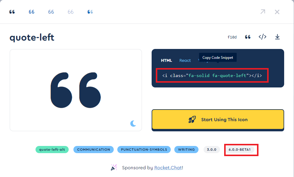
<link rel="stylesheet" href="https://cdnjs.cloudflare.com/ajax/libs/font-awesome/6.0.0/css/all.min.css" integrity="sha512-9usAa10IRO0HhonpyAIVpjrylPvoDwiPUiKdWk5t3PyolY1cOd4DSE0Ga+ri4AuTroPR5aQvXU9xC6qOPnzFeg==" crossorigin="anonymous" referrerpolicy="no-referrer" />The above code shows that it has a fontawesome version 6.0.0, always make sure the version you are using should be supported by the icon that you will use on your site
# second, place the code in the head tag of your Html document
Visit the site by clicking here—-> and search the free icons that you would like to place on your site then at that instant, copy the code and place it in the <body> tag of your Html document
<html>
<head>
    <link rel="stylesheet" href="https://cdnjs.cloudflare.com/ajax/libs/font-awesome/6.0.0/css/all.min.css" integrity="sha512-9usAa10IRO0HhonpyAIVpjrylPvoDwiPUiKdWk5t3PyolY1cOd4DSE0Ga+ri4AuTroPR5aQvXU9xC6qOPnzFeg==" crossorigin="anonymous" referrerpolicy="no-referrer" />
<style type="text/css">
.div10
{

     text-align: center;
     font-size: 3.0rem;
}
</style>
</head>
<body>
<div class="div10"><i class="fa-solid fa-quote-left" style="color:#059e8a;"></i>Hello, World!<i class="fa-regular fa-face-laugh" style="color:#FF0000"></i><i class="fa-solid fa-quote-right" style="color:#059e8a;"></i></div>
</body>
</html>Lets see an example how we can use icons in web apps
<!DOCTYPE HTML><html>
<head>
<meta name="viewport" content="width=device-width, initial-scale=1">
<link rel="stylesheet" href="https://use.fontawesome.com/releases/v5.7.2/css/all.css" integrity="sha384-fnmOCqbTlWIlj8LyTjo7mOUStjsKC4pOpQbqyi7RrhN7udi9RwhKkMHpvLbHG9Sr" crossorigin="anonymous">
<style>
html {
font-family: Arial;
display: inline-block;
margin: 0px auto;
text-align: center;
background-image: url('https://source.unsplash.com/1600x900/?landscape');
}
h2 { font-size: 3.0rem; }
p { font-size: 2.0rem;color:#FFFFFF; }
.units { font-size: 1.2rem; }
.dht-labels{
font-size: 1.5rem;
vertical-align:middle;
padding-bottom: 15px;
}
</style>
</head>
<body>
<h2>ESP32 DHT Server</h2>
<p>
<i class="fas fa-thermometer-half" style="color:#059e8a;"></i>
<span class="dht-labels">Temperature</span>
<span id="temperature">24.06</span>
<sup class="units">°C</sup>
</p>
<p>
<i class="fas fa-tint" style="color:#00add6;"></i>
<span class="dht-labels">Humidity</span>
<span id="humidity">54.33</span>
<sup class="units">%</sup>
</p>
</body>
</html>ESP32 DHT Server
Temperature 24.06 °C
Humidity 54.33 %
Three ways to center an element with CSS
At times, when you were writing a CSS you might have stressed out to center an element in an HTML document
Let me, share with you three ways by which you can center an element
First-method
.First-method
{
   display: flex;
justify-content: center;
align-items: center;
}
Second-method
<html>
<head>

<style type="text/css">
.First-method2
{
 margin: 0 auto;
  border: 1px solid red;
  width: 500px;

}
</style>
</head>
<body>
    <div class="First-method2">hello</div>
</body>
</html>
Third-method
<html>
<head>
<style type="text/css">
#item
{
    top: 50%;
    left: 50%;
    transform: translate(-50% , -50%);
    position: absolute;
}
.parent-div{
}
</style>
</head>
<body>
    <div class="parent-div">
    <div id="item">hello</div>
    </div>
</body>
</html>
Leave a Reply